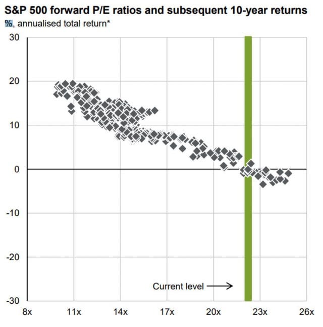
Everyone with a statistics background hates these charts from the JPM Guide to the Markets because the data is very overlapping and accounting for that, you don't have many data points left.
Nonetheless, imo these charts can help you to set some basic expectations across time frames regarding outcome dispersion if you look at the extremes and ignore the stupid regression line...
1-Year Forward
Looking at the chart, we see that we don’t see anything. The point cloud outlines basically mark a square. Meaning looking into the future, you should always expect a looming -25% drawdown regardless of the starting multiple. The biggest 1-year losses even happened following moderate valuation (-40%ish). Similarly, on the bull side, 1-year S&P500 returns seem to be capped at 40-50%, however these best-case outcomes occurred in basically the whole range of starting multiples. Real short-term crashes do not care about starting valuation.
Lesson: For 1-year returns, multiples do not matter. Prepare for the worst, hope for the best but do not make short-term investing decisions based on FwdPEs.
5-Year Forward
The 5-year rolling regression looks cooler on first sight but it still sucks, especially considering that we now enter severe data overlapping. However, also here, looking at the extremes might give us some basic ideas. From a “square” point cloud, we now shifted to a more “rhomboid” shape, which can be described as follows:
Max annualized five-year returns were capped at approximately 20%.
Max return above 10% was not observed for FwdPEs above 22 (so far!).
Min annualized five-year returns were capped at approximately -5%.
Min return below 0% was not observed for FwdPEs below 13 (so far!).
Lesson: Again, prepare for the worst (-5% p.a.) and hope for the best (20% p.a.) but unless you are at extremes (FwdPE <13 oder > 22), you should not even start to think about predicting something imo.
10-Year Forward
Finally, we have this beauty, which is quoted most frequently because of its “clear” message. The overlap is now overwhelming. Shifting a 120-month data series by 12 months, only changes 10% of the data but the chart “sells” it as new independent data point (see also here).
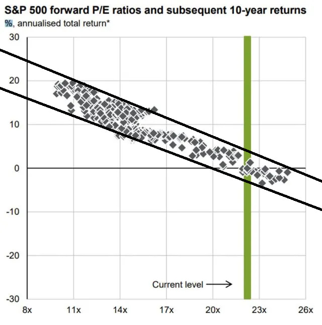
Let’s do something every serious investor loves to do, draw some lines on the chart:
Looking at the extreme observations, we get a “trend channel” (wait for the breakout lol!). Let’s look at some FwdPEs and read the implied min/max returns:
11x —> +12 to +20 %
14x —> +8 to +16 %
20x —> +0 to +7 %
23x —> -3 to +3 %
Now, annualizing a 10-year return can make the outcomes seem more narrow than they are. So let’s translate these into cumulative returns:
11x —> +210 to +519 %
14x —> +116 to +341 %
20x —> 0 to +97 %
23x —> -26 to + 34 %
While the chart looks so nice and linear, this outcome dispersion is still huge. Let’s say we take this stupid channel of two arbitrary lines too seriously for a second and look in the other dimension:
If you target of 5% annualized return, every FwdPE starting multiple between 16 and 21 could have given you these returns in the past. That’s a rather big spread for an index multiple. And that’s ONLY the historic data we have and there is absolutely no guarantee that there won’t be more extreme events in the future, including an unprecedented growth shock (positive or negative), or a decade of unprecedented financial nihilism/mania (or extreme fear) decoupling valuations from reality.
Unless you are at “true” extremes (Multiples <10 or >25), I would not load the bullzooka or bearzooka and make a levered bet in either direction (and even then, please don’t do it, we are talking DECADES here, your brain won’t survive the madness). The broad large-cap market is just too efficient most of the time.
For all cases inbetween, having reasonable best/worst case expectations is much more important (mentally) than trying to predict a year-end S&P500 target.
Prepare for the worst, hope for the best, and stay invested!
Single Stocks
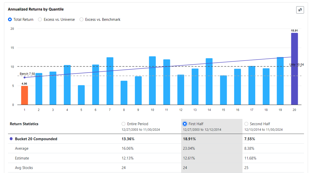
Even within the S&P500, fwd valuations are not really good in predicting outperformance over the next 52 months (since 2004). Here I used a combination of projected FCF, EPS and Sales. On the bottom, you will notice that the backtest underperformed especially since 2014.
Even if we only look at the data from 2004 to 2014, where the world was still a better place and valuation mattered, you quickly noticed that actually only the extremes “mattered”. Beyond the Top and Bottom 5% of cheapest stocks, the results were pretty noisy. And that in the good old long-gone “Valuation Matters” Age.
Valuation still works way better in small and microcaps and if you rebalance more frequently (which you can’t really do on index basis) because there are still inefficiencies to exploit.
But I would not bet on a pure Value concept in largecaps nowadays. In large liquid stocks, outside of a global liquidity crysis, it is just much more unlikely that you see something an army of analysts, traders and asset managers didn’t see.


Really good post but damn it, I was writing about the same thing. Now I can focus on something else because I have nothing to add. Ok, maybe that the outcry about it was a little bit out of proportion. Nevertheless thx you nailed it 👏